giddy.directional.Rose
-
class
giddy.directional.Rose(Y, w, k=8)[source]¶ Rose diagram based inference for directional LISAs.
For n units with LISA values at two points in time, the Rose class provides the LISA vectors, their visualization, and computationally based inference.
- Parameters
- Yarray (n,2)
Columns correspond to end-point time periods to calculate LISA vectors for n object.
- wPySAL W
Spatial weights object.
- kint
Number of circular sectors in rose diagram.
- Attributes
- cuts(k, 1) ndarray
Radian cuts for rose diagram (circular histogram).
- counts: (k, 1) ndarray
Number of vectors contained in each sector.
- r(n, 1) ndarray
Vector lengths.
- theta(n,1) ndarray
Signed radians for observed LISA vectors.
- If self.permute is called the following attributes are available:
- alternativestring
Form of the specified alternative hypothesis [‘two-sided’(default) | ‘positive’ | ‘negative’]
- counts_perm(permutations, k) ndarray
Counts obtained for each sector for every permutation
- expected_perm(k, 1) ndarray
Average number of counts for each sector taken over all permutations.
- p(k, 1) ndarray
Psuedo p-values for the observed sector counts under the specified alternative.
- larger_perm(k, 1) ndarray
Number of times realized counts are as large as observed sector count.
- smaller_perm(k, 1) ndarray
Number of times realized counts are as small as observed sector count.
-
__init__(self, Y, w, k=8)[source]¶ Calculation of rose diagram for local indicators of spatial association.
- Parameters
- Y(n, 2) ndarray
Variable observed on n spatial units over 2 time periods
- wW
Spatial weights object.
- kint
number of circular sectors in rose diagram (the default is 8).
Notes
Based on [RMA11].
Examples
Constructing data for illustration of directional LISA analytics. Data is for the 48 lower US states over the period 1969-2009 and includes per capita income normalized to the national average.
Load comma delimited data file in and convert to a numpy array
>>> import libpysal
>>> from giddy.directional import Rose
>>> import numpy as np
>>> import matplotlib.pyplot as plt
>>> file_path = libpysal.examples.get_path("spi_download.csv")
>>> f=open(file_path,'r')
>>> lines=f.readlines()
>>> f.close()
>>> lines=[line.strip().split(",") for line in lines]
>>> names=[line[2] for line in lines[1:-5]]
>>> data=np.array([list(map(int,line[3:])) for line in lines[1:-5]])
Bottom of the file has regional data which we don’t need for this example so we will subset only those records that match a state name
>>> sids=list(range(60))
>>> out=['"United States 3/"',
...      '"Alaska 3/"',
...      '"District of Columbia"',
...      '"Hawaii 3/"',
...      '"New England"',
...      '"Mideast"',
...      '"Great Lakes"',
...      '"Plains"',
...      '"Southeast"',
...      '"Southwest"',
...      '"Rocky Mountain"',
...      '"Far West 3/"']
>>> snames=[name for name in names if name not in out]
>>> sids=[names.index(name) for name in snames]
>>> states=data[sids,:]
>>> us=data[0]
>>> years=np.arange(1969,2009)
Now we convert state incomes to express them relative to the national average
>>> rel=states/(us*1.)
Create our contiguity matrix from an external GAL file and row standardize the resulting weights
>>> gal=libpysal.io.open(libpysal.examples.get_path('states48.gal'))
>>> w=gal.read()
>>> w.transform='r'
Take the first and last year of our income data as the interval to do the directional directional analysis
>>> Y=rel[:,[0,-1]]
Set the random seed generator which is used in the permutation based inference for the rose diagram so that we can replicate our example results
>>> np.random.seed(100)
Call the rose function to construct the directional histogram for the dynamic LISA statistics. We will use four circular sectors for our histogram
>>> r4=Rose(Y,w,k=4)
What are the cut-offs for our histogram - in radians
>>> r4.cuts
array([0.        , 1.57079633, 3.14159265, 4.71238898, 6.28318531])
We can test whether these counts are different than what would be expected if there was no association between the movement of the focal unit and its spatial lag.
To do so we call the permute method of the object
>>> r4.permute()
and then inspect the p attibute:
>>> r4.p
array([0.04, 0.  , 0.02, 0.  ])
Repeat the exercise but now for 8 rather than 4 sectors
>>> r8 = Rose(Y, w, k=8)
>>> r8.permute()
>>> r8.p
array([0.86, 0.08, 0.16, 0.  , 0.02, 0.2 , 0.56, 0.  ])
The default is a two-sided alternative. There is an option for a directional alternative reflecting positive co-movement of the focal series with its spatial lag. In this case the number of vectors in quadrants I and III should be much larger than expected, while the counts of vectors falling in quadrants II and IV should be much lower than expected.
>>> r8.permute(alternative='positive')
>>> r8.p
array([0.51, 0.04, 0.28, 0.02, 0.01, 0.14, 0.57, 0.03])
Finally, there is a second directional alternative for examining the hypothesis that the focal unit and its lag move in opposite directions.
>>> r8.permute(alternative='negative')
>>> r8.p
array([0.69, 0.99, 0.92, 1.  , 1.  , 0.97, 0.74, 1.  ])
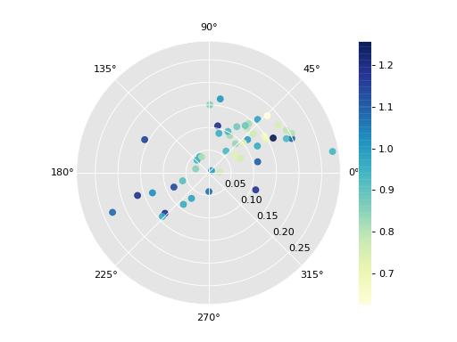
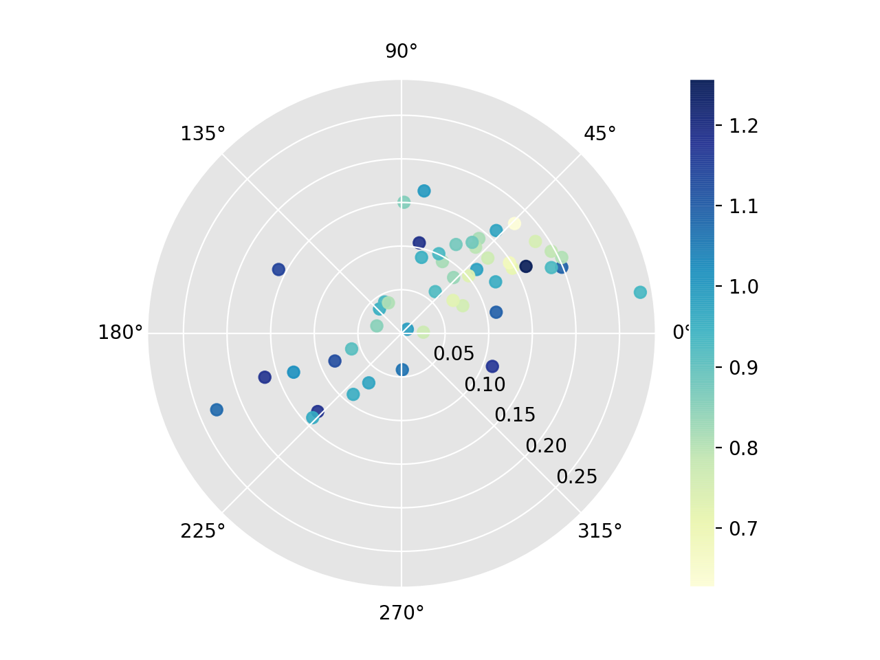
We can call the plot method to visualize directional LISAs as a rose diagram conditional on the starting relative income:
>>> fig1, _ = r8.plot(attribute=Y[:,0])
>>> plt.show()
(Source code, png, hires.png, pdf)
Methods
__init__(self, Y, w[, k])Calculation of rose diagram for local indicators of spatial association.
permute(self[, permutations, alternative])Generate ransom spatial permutations for inference on LISA vectors.
plot(self[, attribute, ax])Plot the rose diagram.
plot_origin(self)Plot vectors of positional transition of LISA values starting from the same origin.
plot_vectors(self[, arrows])Plot vectors of positional transition of LISA values within quadrant in scatterplot in a polar plot.
-
permute(self, permutations=99, alternative='two.sided')[source]¶ Generate ransom spatial permutations for inference on LISA vectors.
- Parameters
- permutationsint, optional
Number of random permutations of observations.
- alternativestring, optional
Type of alternative to form in generating p-values. Options are: two-sided which tests for difference between observed counts and those obtained from the permutation distribution; positive which tests the alternative that the focal unit and its lag move in the same direction over time; negative which tests that the focal unit and its lag move in opposite directions over the interval.
-
plot(self, attribute=None, ax=None, **kwargs)[source]¶ Plot the rose diagram.
- Parameters
- attribute(n,) ndarray, optional
Variable to specify colors of the colorbars.
- axMatplotlib Axes instance, optional
If given, the figure will be created inside this axis. Default =None. Note, this axis should have a polar projection.
- **kwargskeyword arguments, optional
Keywords used for creating and designing the plot. Note: ‘c’ and ‘color’ cannot be passed when attribute is not None
- Returns
- figMatplotlib Figure instance
Moran scatterplot figure
- axmatplotlib Axes instance
Axes in which the figure is plotted
-
plot_origin(self)[source]¶ Plot vectors of positional transition of LISA values starting from the same origin.
-
plot_vectors(self, arrows=True)[source]¶ Plot vectors of positional transition of LISA values within quadrant in scatterplot in a polar plot.
- Parameters
- axMatplotlib Axes instance, optional
If given, the figure will be created inside this axis. Default =None.
- arrowsboolean, optional
If True show arrowheads of vectors. Default =True
- **kwargskeyword arguments, optional
Keywords used for creating and designing the plot. Note: ‘c’ and ‘color’ cannot be passed when attribute is not None
- Returns
- figMatplotlib Figure instance
Moran scatterplot figure
- axmatplotlib Axes instance
Axes in which the figure is plotted